Color Story: How to Use a Warm, Terracotta Palette in a Minimalist Home

Minimalist design is often associated with cool, stark palettes of white, grey, and black. But minimalism is about intention, not the absence of color. One of the most beautiful ways to bring warmth, history, and soul into a minimalist home is with a terracotta color palette. Terracotta is the color of sun-baked earth, ancient pottery, and desert landscapes.
It's a rich, organic hue that can make a modern space feel grounded and incredibly inviting. The key to using this earthy home decor color without overwhelming a simple, clean aesthetic is to use it strategically as a powerful accent.
The 60-30-10 Rule of Color
The best way to introduce any bold color into a minimalist space is by using the classic 60-30-10 interior design rule. This creates a perfect balance, ensuring the space feels cohesive and intentional, not chaotic.
-
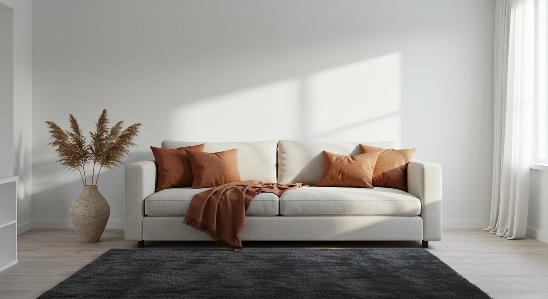
60% Neutral Base: The majority of your room—walls, large furniture pieces like a sofa, and flooring—should be a neutral base. Think soft whites, warm creams, or very light, natural tones. This creates the clean canvas that is the hallmark of modern warm minimalist decor.
-
30% Secondary Color: This is your supporting, textural layer. Natural elements work beautifully here. Think of light wood tones in your furniture, natural linen curtains, or a jute rug. These textures add depth without competing for attention.
-
10% Terracotta Accent: This is where the magic happens. Just 10% of your room's color will be dedicated to your terracotta accent color ideas. This small percentage makes a huge impact because it stands out against the neutral backdrop.
Where to Use Terracotta for Maximum Impact
Because you're only using terracotta as a 10% accent, where you place it matters. The goal is to create small, impactful moments of color.
-
Textiles: This is the easiest and most effective way to introduce terracotta. A pair of rich, rust-colored linen pillows on a cream-colored sofa, a single throw blanket draped over an armchair, or a set of terracotta-hued cloth napkins on a dining table can instantly warm up a room.
-
Ceramics: Terracotta is the color of clay, so using it in ceramic form is a natural fit. A single sculptural vase on a console table (with or without greenery), a collection of small planters on a windowsill, or even your everyday coffee mugs can provide that perfect pop of earthy color.
-
Art: A single, large abstract art print that features terracotta as its dominant color can be a stunning focal point in a minimalist room. It adds warmth and personality while still feeling curated and intentional.
Colors that Complement Terracotta
Terracotta is surprisingly versatile and pairs beautifully with a range of other colors, allowing you to build a more complex and sophisticated palette.
-
Deep Teals and Greens: These cool tones provide a stunning, dramatic contrast to the warmth of terracotta, creating a look that is both balanced and bold.
-
Warm Charcoal and Black: For a moody, modern, and sophisticated vibe, pair terracotta with dark charcoal grey or matte black accents in things like picture frames or light fixtures.
-
Soft Pinks and Blush Tones: For a softer, more romantic and slightly bohemian feel, combine terracotta with muted pinks and blush tones.
Conclusion: Modern and Full of Soul
Using a terracotta color palette in your minimalist home is the perfect way to create a space that feels both clean and modern, yet warm, inviting, and full of soul. It proves that minimalism can be cozy and that a single, powerful color can tell a rich story of earth and history.